Twenty years of blogging (11 serious) and 10 years of serial stories

Hello Friends, Family, and Fans;

I have officially been blogging now for twenty years. My first livejournal post was May 2004. (Wow, was my grammar and spelling bad… it still is but back then it was much worse.) Rereading some posts, it’s a lot of angsty stuff with a little bit of what would become my style.

I blogged on and off until I decided to become an author in 2013. I was told that I needed to have a web presence and a blog was the best way to do it. Not sure if it was, but it’s been worth it in other ways. I’ve managed to write a little every week since then and it’s become part of who I am. Not sure I could stop if I wanted to.

One of the staples since April 2014 has been my Serial Stories. I’m currently writing the 11th annual one (Read Red Day, Ere the Sun Rises) and It’s kept me going when I’ve had trouble writing other things.

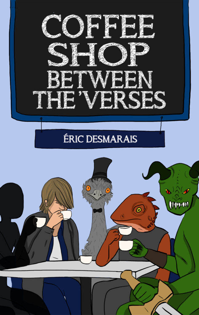
The first 5 years are collected in Coffee Shop Between the ‘Verses.

Coffee Shop Between the ‘Verses

Jackie sometimes likes to have conversations with the characters, and as he reads five novellas in the small Ontario town of Baker…

In The Ridiculous Adventures of Felix Felicitous, the grumpy Felix is thrown into an adventure through time, despite his protestations.

In Only Human, Rachel has accidentally signed up for the University of Monsters.

In Wargrave Island, Inspector Riko Dulac has to find out who’s killing all her former high school classmates before there’s no one left.

In Database of the Ageless Kings, Sophia rebuilds an alien ship, only to find the galactic prince still inside.

In Devices of Desire, follow Artemis, Diana, and Ezekiel as they navigate secret identities, demons, and love in the kingdom of Cillian.

Are the characters Jackie is talking with real? Is he just talking to himself? Or is something else going on?

49th Shelf Coffee Shop Between the 'Verses
Indigo Books Coffee Shop Between the 'Verses
Archambault Coffee Shop Between the 'Verses
Amazon Coffee Shop Between the 'Verses
Rakuten Kobo Coffee Shop Between the 'Verses
Apple Books Coffee Shop Between the 'Verses

Not stopping anytime soon

I’ve accomplished a lot over the past twenty years, and I might not be living off my writing yet (You hear that, Universe: YET). I’m happy with what I’ve done so far and I have SOOOO many more stories to tell. That won’t change, even though other things might.

Thank you to those who have been reading since the beginning, and I hope I’ve helped make your lives a little more entertaining.

Stay safe and be kind,

Éric

Top 5 Book Layout Mistakes

Hello Book Lovers and Authors,

When you self-publish or work with an inexperienced layout artist there are certain mistakes that make your book look bad.

Book publishing is a centuries old industry that has gone through a lot of changes, but certain things have become so standard that you only notice when they’re out of place.

5. Headers and Footers

Headers and Footers are the area above and below the main text. They live in the margins and help tell the reader where they are.

The main mistake with these is if they are missing. However, having too much information or having them too close to the main text makes it hard to read.

The standard pieces of information that should be in the headers and footers are; title of the work, author, and page numbers. You can add or substitute chapter titles if you wish but only if they are more interesting than just “Chapter 1”.

Page numbers are the only things that must be, without any exceptions, included in your header or footer.

Page numbering starts on the first page of the book and not the first page of the content. This means your title page is considered page 1. This can change if your book isn’t a novel.

Headers and footers do not appear on any pages before or after the content or on any pages where the chapter starts.

4. Images

This is an easy one. Printing requires a certain quality of image (300dpi and CMYK colour). Anything below or other than that will look unprofessional.

Some people, me included, like to use silhouettes as dividers and decorations. Use these sparingly and if you can, use vector images that can handle being shrunk easily.

3. Fonts

When reading on a screen, studies have shown that it’s easier to read Sans-Serif fonts. When reading a book it’s the opposite. Always use Serif fonts.

Beyond that, it looks unprofessional to use standard fonts like Times New Roman or fancy fonts like Broadway or *shudder* Comic Sans.

The classic font is Garamond and no one will judge you for using it.

A great resource is: https://fonts.google.com/ The fonts are open source and free.

The above applies to the main text. You can use nearly any font for the chapter titles or your Headers and Footers. I do recommend you limit yourself to 2 or maximum 3 fonts overall and never more than 1 for the main text.

2. Kerning and Leading

Kerning is the space between the characters. If this isn’t consistent, is too tight or too loose; the book will not only look unprofessional, it’ll be borderline illegible. All layout programs have settings for this that are extremely easy to use.

Leading is the space between your lines. Chances are that your High School teachers insisted on you double spacing your essays. If the lines are too tight they start to blend together, if they’re too loose, it’s hard to follow and takes longer to read.

Similar is your Paragraph spacing. If you have a huge space between paragraphs it’ll look messy and cost you more in printing.

1. Typographic Alignment

The biggest, most common, and the first thing people notice is the alignment in your text.

Headers, titles, and images are extremely loose in where they should be aligned, but the main text of your book should always be Left Justified.

This blog is left aligned. The standards for web are different because of the glow caused by the screen.

The moment I see a jagged right margin on a book I know it was formatted by an amateur. It’s an industry standard because it works. When combined with proper kerning it is easier for the eye to go from one page to the next.


A good Layout Artist will make sure that all these things are taken care of and that your book looks great. See Why Your Book Needs a Layout Artist!

I offer layout services if you ever need help.


Good reading and good writing,

Éric